The short version: Most construction Power BI reports don't need rebuilding. They need a structured review: are the sources fresh, is the model shaped correctly, do the measures add up the way finance expects, is missing data visible, and can a project manager read each page without a walkthrough. This guide is the review method we use, with a prioritized checklist at the end.
A report that people have stopped trusting usually still has value in it. The connections work, someone has already mapped projects, and the pages answer roughly the right questions. What it lacks is a reason to be believed: a visible refresh time, measures that match the accounting system, and a clear signal when data is missing.
The examples below come from the Monthly Progress Report and Project Quality Plan we built for a general contractor on Procore, Sage 100 Contractor and Outbuild. The Construction Project Reporting showcase shows every page; the Fabric build story covers the pipeline underneath. You don't need that stack to apply any of this.
Start with the questions, not the visuals
Before opening Power BI Desktop, list who uses the report and what each person needs to decide from it. A controller wants WIP and AR as of month end. A project executive wants budget health and overdue milestones. A safety lead wants incidents and open observations.
Then take three or four recent figures that someone actually relied on and trace each one back to its source. If you can't get the same number from Procore, the accounting system or the schedule, you've found the first fix. That trace tells you more than any amount of formatting review.
1. Sources and refresh
Most trust problems start here. A report can be perfectly modeled and still wrong because last night's refresh failed and nobody noticed.
What to check:
- Every source and how it connects. Cloud APIs, files on SharePoint, exports someone drops in a folder, and on-premises databases. In our build, Sage 100 Contractor is an on-premises SQL database reached through a data gateway. An on-premises data gateway is a common failure point: it runs on a machine that can be rebooted, patched or switched off.
- Scheduled refresh history. Open the semantic model's refresh history in the Power BI service and look for failures, timeouts and credential errors. Confirm that failure notifications go to someone who will act on them, not to a former employee. Microsoft's refresh troubleshooting guide covers the common causes.
- Manual steps. Any spreadsheet that has to be exported and re-uploaded before refresh is a step that will eventually be skipped. Note each one; they're candidates for automation or a structured input like a SharePoint list.
- Freshness on the page. Readers can't see refresh history. Put the last refresh time on every page. In our reports, every footer shows the reporting month, the last refresh time and a plain-text pipeline status: passed, warnings, late, stale or blocked.
The principle: a stale answer beats a wrong one. If a load half-completes, the report should keep yesterday's correct numbers and say they're a day old, rather than calculating against partial data. In our build, publication only happens after about 200 automated data-quality checks pass. You don't need a full pipeline to start: a visible "last refreshed" timestamp plus an alert on failure covers most of the risk.
2. The data model
Open Model view. A reliable construction model looks like a star schema: fact tables (budget lines, invoices, pay applications, milestones, observations) surrounded by shared dimensions (project, date, cost code, vendor).
What to check:
- One project dimension. If Procore projects and accounting jobs are separate, unrelated tables, every cross-system visual is wrong in some way. They need one shared project table, fed by a crosswalk that maps project IDs to job numbers. Keep that crosswalk as data, not as logic buried in measures.
- Relationship direction and cardinality. Look for many-to-many relationships and bi-directional filters. Both have legitimate uses, but in an inherited report they're often workarounds for a missing dimension and produce totals nobody can explain.
- Granularity. Know what one row means in each fact table. A budget table with one row per cost code per month behaves very differently from one with one row per cost code. Mixing grains in one table is a common source of double counting.
- A proper date table. Marked as a date table, related to every fact, covering the full range of your data.
- Snapshot history. Many construction figures are "as of today" values: open submittals, AR outstanding, punch backlog. If the model only holds today's state, last month's numbers can't be reproduced. We save point-in-time balances on each passing run, so month-end trends are real history. Months before snapshots began read as unavailable, not zero.
3. DAX measures
Construction data has a few shapes that break naive measures. These are the ones we check first.
Calculate per job, then sum
Ratios and thresholds usually need to be evaluated per project before they're totaled. If you calculate "over budget" on the portfolio total, one large underrun hides several overruns. Iterate over projects, evaluate each, then aggregate:
Projects Over Budget =
SUMX (
    VALUES ( 'Project'[ProjectKey] ),
    IF ( [Spent to Date] > [Budget] * 1.05, 1, 0 )
)
Never average percentages
Averaging percent-complete or margin percentages across jobs weights a small service job the same as a large building. Compute the ratio of the totals instead:
Billed % of Contract =
DIVIDE ( [Total Billed], [Current Contract] )
DIVIDE also returns blank rather than an error when the denominator is zero or missing, which is the behavior you want.
Running balances: read the latest period
Pay applications are the classic trap. Columns like contract sum, billed to date and retainage held are running balances: each period restates the cumulative position. Summing them across periods multiplies them. In our build, balances are read only from each contract's latest issued (owner) or approved (subcontractor) pay app. The same applies to any monthly table that repeats contract values; contract figures take each project's latest month so repeats aren't double counted.
Retainage Held by Owner =
SUMX (
    VALUES ( 'Owner Pay App'[ContractKey] ),
    CALCULATE (
        SUM ( 'Owner Pay App'[RetainageHeld] ),
        LASTNONBLANK ( 'Owner Pay App'[PeriodEnd], 1 )
    )
)
Exact syntax depends on your model; the point is to pick one period per contract before summing.
Reconcile, don't add
If you hold the same cost in two systems, such as Procore spend and accounting AP job cost, use one as the reported figure and the other to reconcile. We show Procore spend against Sage AP job cost by project and never add them together.
Measure hygiene
Check for duplicate measures with slightly different logic (three versions of "Total Billed" is common), hard-coded filters for a specific project or month, and measures nobody uses. Put measures in display folders by business area so the next person can find them. Our two models hold about 180 measures across ten areas, and they're only maintainable because they're organized that way.
4. Definitions and metric contracts
Most arguments about a report are really arguments about definitions. "AR outstanding" can mean the balance today, the balance at month-end cutoff, with or without retainage, with or without unapplied credits.
For each headline figure, write a short metric contract:
| Field | What to record |
|---|---|
| Question | The business question the number answers |
| Definition | What is included and excluded, in plain words |
| Source | Which system and table is authoritative |
| Grain and timing | Per job, per month, as of which cutoff |
| Rules | Retainage treatment, credit balances, unmapped records |
| Owner | Who approves changes to the definition |
Then make the definition visible in the report: a tooltip, a short note on the page, or a link to a metric dictionary. When a controller can read how "cost to complete" is calculated without asking, the conversation moves from "is this number right?" to "what do we do about it?"
5. Missing data: blank, never zero
This is the most common silent error in inherited reports. A project missing from accounting shows zero revenue. A project with no safety hours logged shows zero incidents, which looks like a perfect record.
What to check:
- Measures that coerce blanks to zero. Patterns like
+ 0orCOALESCE([Measure], 0)are often added to make visuals look tidy. Remove them wherever zero would be misleading. - Coverage measures. Show how much of a figure is actually measured. Our project scorecard includes a coverage percentage, and a category with no data scores blank rather than zero.
- Cross-system coverage. Check each project's presence in the PM system, accounting and the scheduler. Our Source Coverage page lists every project and what it's missing, so a project absent from accounting can't quietly report zero.
- An unresolved-records list. Rows that don't match should be listed, not dropped. Each entry should name the system where it gets fixed. Once it's fixed at the source, it drops off after the next refresh.
6. Performance basics
A slow report gets abandoned. Start by measuring rather than guessing: Performance Analyzer in Power BI Desktop shows how long each visual takes and whether the time is in the DAX query or the rendering.
Common, low-risk improvements:
- Fewer visuals per page. Each visual sends its own queries. A page with 30 cards is slower than one with a table showing the same figures.
- Remove unused columns and tables. Especially high-cardinality text columns (long descriptions, GUIDs) that nothing uses.
- Push transformations upstream. Shaping done in Power Query or a lakehouse layer once is cheaper than calculated columns and complex measures evaluated at query time.
- Simplify relationships. Removing unnecessary bi-directional filters helps both correctness and speed.
Microsoft's optimization guidance for Power BI covers storage modes, capacity and query reduction in more depth. Fix correctness first: a fast wrong number is still wrong.
7. Usability
The test is whether someone who didn't build the report can use it without a walkthrough.
- One question per page. "Budget health by cost code" is a page. "Everything about the project" is not. Our Financial page answers budget health, change orders and billing progress for the selected project and month, and nothing else.
- A how-to-read note. Every page in our reports carries a short paragraph explaining what it shows and how to use it. It costs a few minutes to write and saves a lot of explaining.
- Consistent slicers. The same Project and Month slicers in the same place on every page, with sync enabled.
- Drill-through for detail. Rather than cramming project detail onto summary pages, add a drill-through page. In our reports, right-clicking any project opens a single-project view with budget, change orders, RFIs, submittals and milestones.
- Text status, not just color. Status flags like "Spend over budget above 5%" are text measures, so they survive printing in greyscale, work for color-blind readers, and can be exported. Red-amber-green alone fails all three.
- Print and export. Many construction reports still end up in a board pack or owner meeting. Check that pages print legibly at the size people actually use.
8. Governance and access
Review who can see and change what.
- Workspace roles. Admin, Member, Contributor and Viewer grant very different rights. Most readers need Viewer access or access to an app, not workspace membership. See Microsoft's workspace roles documentation.
- Sharing. Distribute through an app or controlled sharing, and confirm that publish-to-web has not been used on anything containing financial data.
- Row-level security. If project managers should only see their own jobs, implement it in the model rather than relying on separate copies of the report.
- Ownership. Name an owner for the semantic model, for refresh credentials and for each metric definition. A report owned by "whoever built it" stops being maintained when that person moves on.
- Change control. At minimum, keep the .pbix or project files under version control with a note on what changed. Our models, reports, SQL and quality rules deploy from version control by script, so every change is reviewable and reversible.
Prioritized review checklist
Work top to bottom. The early items fix wrong numbers; the later ones make correct numbers easier to use.
| Priority | Check | Why it matters |
|---|---|---|
| 1 | Refresh failures alert a named person; last refresh time shows on every page | Readers can't tell stale data from current data otherwise |
| 2 | Three headline figures traced and matched to source systems | Confirms whether the core numbers can be trusted |
| 3 | Running balances (pay apps, contract values) read from the latest period only | Summing them across periods multiplies them |
| 4 | Ratios computed from totals, thresholds evaluated per job | Averages and portfolio-level flags hide problems |
| 5 | Blanks are not coerced to zero; coverage is visible | Missing data otherwise looks like good results |
| 6 | One shared project dimension with a maintained crosswalk | Cross-system visuals depend on it |
| 7 | Star schema with known grain per fact table and a marked date table | Prevents double counting and broken time intelligence |
| 8 | Metric contracts written and approved for headline figures | Ends arguments about what a number means |
| 9 | Unmatched records listed with the system to fix them in | Data quality becomes a task list |
| 10 | Snapshot history for "as of today" figures | Month-end trends become real history |
| 11 | Performance Analyzer run on the slowest pages | Finds slow visuals with evidence |
| 12 | One question per page, how-to-read notes, drill-through, text status | Readers can use it without a walkthrough |
| 13 | Workspace roles, sharing and row-level security reviewed | Financial data reaches only the right people |
| 14 | Owners named; files under version control | Keeps the report maintained after handover |
If items 1 to 5 fail, fix those before anything else. They're usually small changes with a large effect on trust.
When to improve and when to rebuild
Improve when the sources are right and the problems are in measures, definitions, freshness or layout. That covers most inherited reports.
Consider rebuilding the data layer when the report depends on manual exports every month, when projects can't be matched across systems without hand work, or when logic for the same figure lives in several disconnected files. In those cases the fix is upstream: a governed data layer the report reads from, which is what the Fabric build describes. The pages themselves can often be kept.
Where to go next
- If your monthly report still depends on exports and spreadsheets, see how we approach a monthly report replacement.
- See a full example of these principles in production in our construction reporting work.
- Check how headline metrics are defined in the metric dictionary.
- Score your current setup with the free reporting readiness checklist.
Frequently asked questions
Can you improve an existing Power BI report instead of rebuilding it?
Usually, yes. If the sources are right and the problems are in measures, definitions, refresh or layout, a structured review and targeted fixes are enough. A rebuild of the data layer is worth considering when the report depends on monthly manual exports or projects cannot be matched across systems without hand work.
Why do my Power BI retainage or pay application totals look too high?
Pay application fields such as billed to date and retainage held are running balances that restate the cumulative position each period. Summing them across periods multiplies them. Read each contract's latest issued or approved pay app instead, then sum across contracts.
Should I average percent complete or margin across projects in Power BI?
No. Averaging percentages weights a small job the same as a large one. Compute the ratio from totals, for example total billed divided by current contract, and use DIVIDE so a missing denominator returns blank instead of an error.
How do I know if my Power BI report data is current?
Check the semantic model's refresh history in the Power BI service and make sure failure notifications reach someone who will act on them. Then put the last refresh time on every report page so readers can see it without opening the service.
How do I find out why a Power BI report is slow?
Run Performance Analyzer in Power BI Desktop to see how long each visual takes and whether the time is spent in the DAX query or rendering. Common fixes are fewer visuals per page, removing unused high-cardinality columns, moving transformations upstream and simplifying relationships.
Next step
Trying to automate a report like this?
Discuss your current reporting process: what the team does today, which systems are involved, and what you want to change.
Prefer email? charley@buildflows.ai
Keep learning
Reporting & analytics · October 8, 2026
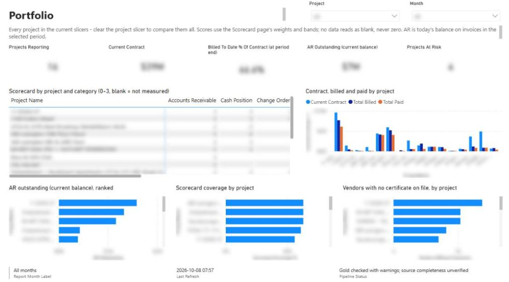
Construction Project Reporting: Solution Showcase
Two Power BI reports—22 pages and ~180 measures—that replaced a general contractor's hand-filled monthly progress and QA/QC workbooks. Computed nightly from Procore, Sage 100, Outbuild, and SharePoint, and published only after ~200 data-quality rules pass.
Reporting & analytics · October 7, 2026
How We Built Construction Reporting in Microsoft Fabric
The engineering behind a nightly Procore + Sage + Outbuild reporting platform in Microsoft Fabric: medallion lakehouse, cost-code mapping, a quality gate, and building it with Claude and MCP servers.
Reporting & analytics · October 8, 2026
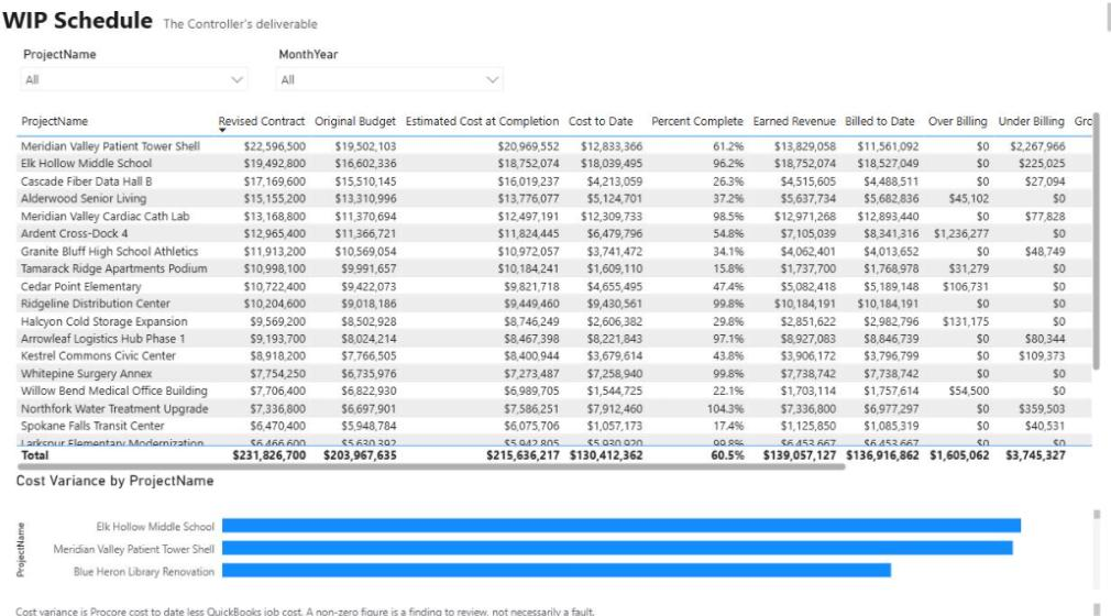
Construction WIP Reporting in Power BI: A Controller's Guide
A practical guide to construction WIP reporting in Power BI: the formulas, where the data comes from in Procore and accounting, the mistakes that make a WIP schedule look right while being wrong, and how to automate it.