The short version: Procore, Sage 100 Contractor and Outbuild data are extracted by Fabric notebooks, landed in a bronze lakehouse, cleaned in silver, modeled in gold, checked by about 200 data-quality rules, and only then published through semantic models to two Power BI reports. We built it with Claude working through MCP servers for Fabric, Azure and Power Automate, and tested the finished reports with Claude in Chrome.
This article is the engineering story behind that platform: what problem it solves, how the data moves, why each layer exists, and what we would tell anyone building something similar. If you want the page-by-page tour of the reports and the metric definitions, read the Construction Project Reporting showcase. This piece stays under the hood.
The problem: a monthly report built by hand
Before this build, the monthly progress report was assembled manually. Someone exported data from Procore, exported data from Sage, pasted both into an Excel workbook, mapped cost codes and projects by hand, and recalculated the totals. Then they did it again the next month.
That process has three costs that compound:
- Time. The report is rebuilt from scratch every month instead of being available whenever someone needs it.
- Errors. Every manual calculation is a chance to get a number wrong, and nobody downstream can see where the number came from.
- No validation. Data that no system tracks (wins, risks, safety and quality registers) lived in shared spreadsheets. As Charley puts it in the walkthrough, there was "no type of validation of the data or any type of verification that the data was properly input."
The goal was simple to state: pull all of it live, keep it tied to actuals, and stop anyone from having to run their own calculations.
What the platform has to connect
Three operational systems and one manual-input layer feed the reports:
| Source | What it holds | How it arrives |
|---|---|---|
| Procore | Projects, budgets, commitments, direct costs, billing and retainage, vendors, insurance certificates, observations, punch, submittals, inspections | Cloud API, extracted by notebooks |
| Sage 100 Contractor | AR and AP invoices, jobs, vendors | On-premises SQL through a data gateway |
| Outbuild | Schedule milestones and activities | Cloud API, extracted by notebooks |
| SharePoint lists | Wins, risks, safety, quality and QC registers that no system tracks | Lists landed alongside the system data |
The hard part is not getting data out of any one of these. It is making them agree. Procore projects need to match Sage jobs. Old cost codes need to map to the new standard being rolled out across both systems. Outbuild schedules need to be assigned to the right Procore project. Vendors in Sage need to line up with invoices. Every one of those joins is a place where a number can silently go wrong.
How the data flows: bronze, silver, gold
The platform uses a medallion architecture, which is a standard lakehouse pattern in Microsoft Fabric. Each layer has one job.
- Extract with notebooks. Fabric notebooks pull from Procore, Outbuild and Sage. The SharePoint lists are landed too, so manual inputs travel the same path as system data.
- Bronze: land it as received. Raw data goes into the bronze lakehouse with load stamps. Keeping the raw payload means a logic fix is a re-run, not a re-extract from the source.
- Silver: clean and validate. Values are typed and trimmed; stray spaces and badly formatted fields are fixed. Rows that fail checks go to a rejects table with a reason instead of disappearing.
- Gold: build the source of truth. The gold lakehouse holds the modeled facts and dimensions the reports use. This is where the cost-code mapping and the Procore-to-Sage crosswalk are applied, so every downstream number uses the same answers.
- Gate: run the checks. About 200 automated data-quality rules run against gold. A blocking failure stops publication.
- Publish: refresh the semantic models. Each report has its own semantic model. They refresh only after the gate passes, and the reports read from them.
Why the gate matters more than the dashboards
The most important design decision is what happens when something breaks. If a run fails at any point, the reports keep the last good data. Nothing is calculated against a half-loaded dataset. Every report page shows when it last refreshed, so a reader can see how current the numbers are.
This is the principle we call a stale answer beats a wrong one. A controller can work with yesterday's correct numbers. They cannot work with today's wrong ones, and they will stop trusting the report the first time it happens.
Unresolved records instead of silent drops
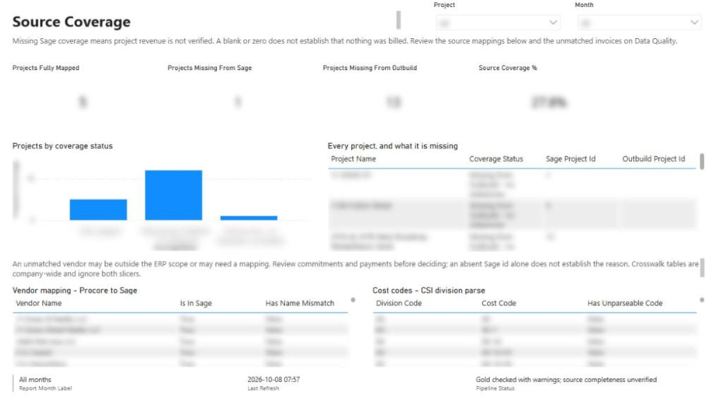
The second decision: data that does not line up is never quietly excluded or forced into a total. The reports calculate from the actuals that resolve cleanly and route everything else to an Unresolved Records worklist. In the walkthrough, that list shows things like AP invoices "floating" without a Sage job, and a Procore project not yet assigned to a Sage project.
Each item names what is wrong and where to fix it, so the team corrects it in the source system and it drops off after the next run. That is flag, never drop and fix it at the source in practice. It also explains a detail you might otherwise read as a bug: some Outbuild projects are unmapped because they are still in pursuit and do not exist in Procore yet. The worklist makes that visible rather than hiding it.
Mapping old cost codes to new ones
The client was moving to a new cost-code standard shared between Procore and Sage. Historical actuals were recorded under the old codes. If you report budgets and actuals across that boundary without a mapping, you get two half-empty columns instead of one complete one.
The mapping exercise lives in the backend notebooks. Old codes are translated to the new standard during the transformation, so every report sees one consistent code structure, and the intent is that codes map fully to the new standard. Where new codes may be needed, they go back to the client as an open question rather than being invented in the pipeline. The mapping tables are reference data under version control, so a change to the map is reviewed and re-run like any other code change.
If you are planning a cost-code migration, do this mapping as data, not as formulas inside report visuals. A crosswalk table can be audited, tested and reused. Logic buried in a DAX measure cannot. See the glossary entry on crosswalks for the general pattern.
Semantic models: one per report
Each report has its own semantic model sitting on top of the gold layer. The model defines the tables, the relationships between them (project, date, cost code, vendor) and the measures the visuals use. As the walkthrough notes, it "can get pretty expansive," because a single record often relates to several others, and assigning each field to the right object is where most of the modeling effort goes.
Two models rather than one is a deliberate choice. The Monthly Progress Report is about how projects are progressing financially and on schedule. The Project Quality Plan is about the quality of the work: observations, punch, submittals, inspections, statutory gates and trade checklists. Separating them keeps each model smaller and easier to reason about, while both read from the same governed gold data.
Querying gold directly through the SQL endpoint
Power BI is not the only way in. The gold lakehouse exposes a SQL endpoint, and under the dbo schema you can see every table, plus the views and functions the reports use. Tables hold the row and column values; views shape the data for the reports.
That matters for validation. When someone asks "where did this number come from?", the fastest answer is to open the project or vendor table in the SQL endpoint and look at the exact rows feeding the report. You can export from there if you need to. In our experience this is one of the most useful habits for building trust in a new reporting platform: let the finance team see the rows, not just the totals.
Credentials and access: the slow part nobody budgets for
Getting access took real time. The build needed credentials for Procore and Sage, access to the on-premises data gateway for Sage, a Fabric workspace, and access to Key Vault.
All source credentials are stored in Azure Key Vault rather than in notebooks or pipeline definitions, and source connections are read-only. If you are scoping a similar project, put access requests at the very start of the plan. The code moves faster than the approvals.
Building it with Claude and MCP servers
Here is the part that changes the economics of a build like this. Much of the engineering was done with Claude connected to three MCP servers:
| MCP server | What it did in this build |
|---|---|
| Fabric | Created and updated notebooks, uploaded files, reassigned and re-associated data, and created, validated, tested and looked up items in the workspace |
| Azure | Worked with the Azure side of the solution: hosting and the Key Vault setup |
| Power Automate | Built supporting automations, such as setting up a project correctly once a new project is won |
The Model Context Protocol gives an AI assistant a defined set of tools to call against a real system. With a Fabric MCP server connected, Claude does not just suggest notebook code; it can create the notebook in the workspace, test it, read the result and fix what failed. The engineer stays in charge of design decisions and review, and the repetitive work of wiring tables, measures and pipeline steps goes much faster.
The platform is also built as code. Notebooks, semantic model definitions, SQL and quality rules live in version control and deploy by script, so a change is reviewed and redeployed rather than rebuilt by clicking through a UI.
Testing the reports with Claude in Chrome
The last mile is checking that the reports actually work for a person using them. For that we used Claude in Chrome, which drives a Chrome browser: it loads the report, views it, clicks through the pages and slicers, and checks what is displayed. That can catch problems a data test misses, such as a filter that does not apply, a page that renders blank, or a visual that does not match the number in the gold table.
What this means if you run a construction business
You do not need this exact stack to apply the lessons. The pattern adapts to whatever project management, accounting and scheduling systems you run. Our Procore, QuickBooks and HubSpot example uses the same approach for a contractor running cloud accounting and a CRM.
The practical takeaways:
- Map once, in data. Cost-code and project crosswalks belong in versioned tables, not spreadsheets or report formulas.
- Gate before you publish. Decide in advance that a failed run leaves the last good numbers in place, and show the refresh status on every page.
- Route gaps to a worklist. Every unmatched record should name the system where it gets fixed. That turns data quality into a task list rather than an argument.
- Give the manual data a home. Some information lives in no system. Structured SharePoint lists with defined fields are better than a shared workbook, and they flow through the same pipeline.
- Expose the rows. A SQL endpoint over the gold layer lets finance verify numbers themselves.
- Start access early. Credentials, gateways and Key Vault permissions are on the critical path.
What comes next on this build
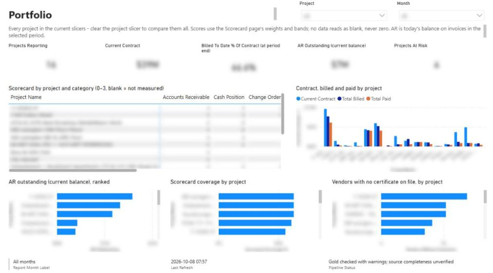
The remaining work is about people, not pipelines: reviewing the data-quality and unresolved-records lists with the team, answering the open mapping questions, and getting project managers and executives entering data into the SharePoint lists. In the walkthrough, scorecard coverage sits at 71% because the remaining measures depend on those manual inputs. As the lists fill, coverage rises without any change to the platform.
Where to go next
- Watch the full walkthrough on the Procore + Sage + Outbuild demo page.
- See every report page and metric in the Construction Project Reporting showcase.
- New to the lakehouse pattern? Read Microsoft Fabric for contractors.
- If your month-end still runs on exports and Excel, tell us what you want to build.
Frequently asked questions
Can Microsoft Fabric pull data from Procore and Sage 100 Contractor?
Yes. In this build, Fabric notebooks call the Procore API directly, and Sage 100 Contractor data is read from its on-premises SQL database through a data gateway. Both land in a bronze lakehouse before being cleaned and modeled.
What is a bronze, silver and gold lakehouse?
It is a medallion architecture. Bronze stores raw data as received, silver cleans and validates it, and gold holds the modeled tables that reports use. Each layer has one job, which makes problems easier to trace and fix.
What happens if the nightly refresh fails?
Publication is blocked and the reports keep the last good data. Every page shows the last refresh time, so readers can see how current the numbers are. A stale report is safer than a wrong one.
How do you map old cost codes to a new cost-code standard?
Keep the old-to-new map as a versioned reference table and apply it in the transformation notebooks, so every report uses the same mapping. Codes that do not map cleanly are raised with the client rather than guessed.
How does Claude help build a Fabric data platform?
With a Fabric MCP server connected, Claude can create and update notebooks, upload files, and run, validate and test items in the workspace. Azure and Power Automate MCP servers covered Key Vault and supporting automations, and Claude in Chrome clicked through the finished reports to test them.
Can finance verify the numbers outside Power BI?
Yes. The gold lakehouse exposes a SQL endpoint where the exact tables feeding the reports can be queried and exported. That lets controllers check the rows behind any total.
Next step
Have a problem like this?
Tell us the outcome you need. We'll tell you honestly how we'd approach it, and reply within two business days.
Keep learning
Reporting & analytics · October 8, 2026
Construction Project Reporting: Solution Showcase
Two Power BI reports—22 pages and ~180 measures—that replaced a general contractor's hand-filled monthly progress and QA/QC workbooks. Computed nightly from Procore, Sage 100, Outbuild, and SharePoint, and published only after ~200 data-quality rules pass.
Reporting & analytics · October 8, 2026
Microsoft Fabric for Contractors: A Lakehouse Guide
A practical guide to Microsoft Fabric for construction: the medallion lakehouse, notebooks, Direct Lake models, quality gates, the SQL endpoint, cost considerations, and when Fabric is the wrong choice.

Integrations · August 18, 2026
How We Joined Procore, QuickBooks and HubSpot in Microsoft Fabric
A build walkthrough of the pipeline that joins Procore projects, QuickBooks jobs and HubSpot deals in Microsoft Fabric, including the crosswalk that refuses to guess and the gate that stops wrong numbers.