Most contractors have one: the monthly report workbook. It grows a tab at a time, someone inherits it, and every month a person spends days copying numbers out of Procore and the accounting system into cells that feed other cells. It works, until a formula quietly breaks and nobody notices.
This article walks through how we rebuilt one construction company's monthly report end to end, from the Procore API through Microsoft Fabric to Power BI. It covers what the old process looked like, how the new pipeline is put together, the decisions behind it, and what we found along the way, including two scoring errors that had been hiding in the original workbook.
What the manual monthly report looked like
The report we replaced was an 11-tab Excel workbook with roughly 700 manually maintained input cells, 17 tables and one chart. Every input cell was a number someone had to find in an operational system and key in by hand.
That pattern has three structural problems, none of which are anyone's fault:
- The data is a copy of a copy. Numbers in the workbook are snapshots of numbers in Procore and the accounting system. As soon as the source changes, the report is out of date.
- Validation depends on whoever is typing. A spreadsheet will happily accept a wrong value, a missing project, or a date in the wrong format.
- Logic is invisible. Scoring rules and calculations live in cell formulas. They are hard to review, hard to test, and easy to break without anyone seeing an error.
The goal was not to make a prettier version of the workbook. It was to make the monthly report something the systems produce on their own, with checks that stop bad data before it reaches an executive.
The stack
| Layer | What it does in this build |
|---|---|
| Procore API | Projects, budgets, commitments, billings, submittals, RFIs, observations, punch items, incidents, vendors and insurance |
| Sage 100 Contractor | AR and AP through read-only SQL access |
| Outbuild | Schedule milestones and project planning data |
| SharePoint (and a CSV fallback) | Structured capture for fields no source system holds |
| Microsoft Fabric | Lakehouses, notebooks, Data Pipelines, Direct Lake |
| Power BI | 12 report pages, 180 visuals, drill-through, bookmarks and executive scorecards |
The semantic model is a star schema with 99 measures, refreshed automatically instead of rebuilt by hand.
How the pipeline works, step by step
The build follows a medallion architecture: bronze for raw data, silver for cleaned data, gold for the curated model that reporting reads from. Here is the flow in order.
- Extract from Procore. A single notebook handles authentication and then loops through every Procore endpoint the report needs. We did not write one notebook per endpoint. One extraction file covers every data point, so adding a new endpoint is a small change, not a new pipeline.
- Land manual inputs. Some fields that matter in a monthly report, like project update notes, do not live in any system. Users enter them through a SharePoint page mapped to the same fields as a CSV template. Entries are associated with a project and a reporting period, and several people can log against the same project.
- Store raw payloads in bronze. Bronze keeps the full API payloads with audit columns and no transformation. That choice matters later: if a transformation has a bug, we re-run from bronze instead of re-extracting everything from the API.
- Clean and type in silver. Silver trims, types, standardizes and validates. Rows that fail validation are written to a rejected-rows log with a reason. Nothing is silently dropped. Sage financial data joins here through SQL alongside the Procore data.
- Build gold. Gold pulls the silver tables it needs and builds dimensions, facts, crosswalks and bridges. The build itself runs validation as it goes.
- Run the data-quality gate. 63 data-quality expectations check the gold data before anything is published.
- Map and calculate. A query step maps fields, normalizes dates and applies the calculations the report needs, then writes the result to the gold lakehouse.
- Serve through the semantic model. Power BI reads the gold tables through Direct Lake and the measures in the semantic model.
The sequence we hold to is:
Extract → Validate → Transform → Validate → Publish
Validation happens on every run, not once at go-live. The point is simple: a polished dashboard is still unreliable if incomplete or invalid data reaches the semantic model.
Decisions that shaped the build
Keep raw data, always
Storing full payloads in bronze costs a little storage and saves a great deal of pain. When a calculation changes or a mapping turns out to be wrong, the fix is a controlled re-run over data you already have, not a full re-extraction from the API. You can also trace any reported number back to the payload the source actually returned.
Reject with a reason instead of dropping
When a record fails a silver check, it goes to a rejected-rows log with the reason attached. This follows two of our design principles: flag, never drop and fix it at the source. A dropped row is invisible. A logged row tells someone exactly which record in which system needs correcting.
One project key across every system
The most important mapping work in this build was the project dimension. Procore, Sage and Outbuild each have their own idea of what a project is and how it is identified. Every one of them has to resolve to the same project in dim_project, or the financials, schedule and quality pages will not line up. That is what a crosswalk is for, and it is the part of any multi-system reporting build worth getting right first.
Dates were the other big normalization job. Due dates and period dates arrive in different formats and need to be consistent before any time-based measure makes sense.
Capture manual fields, but give them structure
Not everything a monthly report needs exists in a system. Rather than leave those fields in a spreadsheet, we gave them a home. The CSV path works, but a CSV has no validation: a user can enter a field incorrectly and nothing stops them. The SharePoint page is mapped to the same fields and validates inputs at entry. Either way, the data lands in the lakehouse and joins to the project like everything else.
Direct Lake, not Import
The semantic model uses Direct Lake, which reads Delta tables in the lakehouse directly instead of copying data into an imported model on a refresh schedule. That improves refresh behavior and keeps the report close to the gold data. It also has tradeoffs that require careful modeling, so the star schema has to be designed with it in mind, not bolted on afterward. Microsoft's Direct Lake overview covers the mechanics.
What the report pages cover
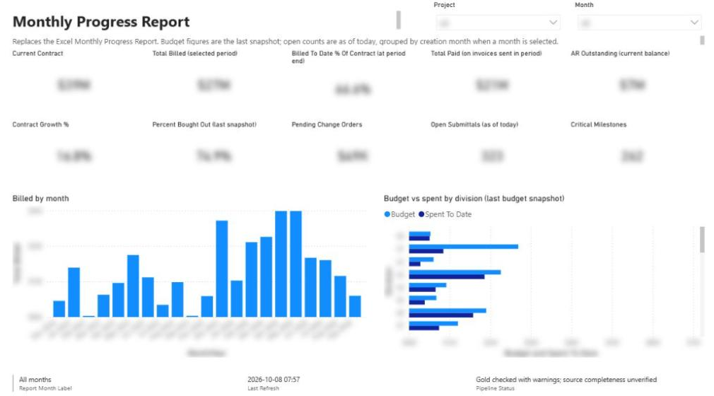
The rebuilt report has 12 pages. In the walkthrough we step through these:
- Portfolio: current projects in contract and new builds, with a project selector that filters everything below it.
- Overview: a broad view of each project's budget, spend and amounts paid.
- Financials: budgets, spend to date, percent complete and variances.
- Schedule: milestones and submittal data. At the time of recording this came from Procore, with the Outbuild schedule feed being connected.
- Safety and quality: punch items, incidents and daily logs from Procore.
- Billing and retainage: contract values, outstanding invoices and retainage.
- Direct costs: cost breakdowns by cost code and the vendors associated with them.
- Vendor insurance: which vendors have certificates on file and which are missing.
- Scorecard: a project score plus how much of the expected data is actually present.
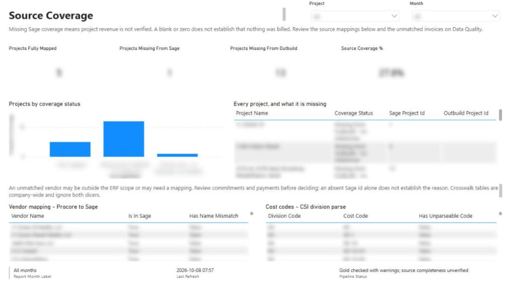
- Source coverage: where every record came from and whether it is present, missing, delayed or unmatched.
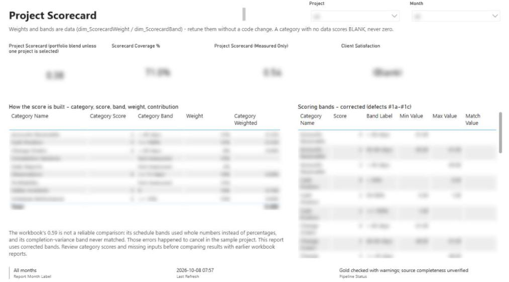
The scorecard bug the spreadsheet was hiding
Rebuilding the scoring logic in code meant reading every formula in the original workbook. Two of them were wrong:
- Schedule Performance compared values against an incompatible scale, so it fell through to an incorrect default score.
- Completion Variance did not match any defined scoring band, so it returned zero.
On the sample project, the two errors happened to offset each other. The total score looked right, which is exactly why nobody had caught it. Roughly 42% of the scorecard weighting was disconnected from actual project performance.
The lesson applies to any report that lives in Excel. The workbook is not wrong because someone was careless. It is wrong because cell formulas cannot be tested, and offsetting errors look like correct answers. In the rebuilt platform, scoring logic is explicit, testable and maintainable.
Source coverage is a first-class page
Here is a failure mode that never throws an error: a project that is missing from the financial system shows up as $0 revenue, $0 billing and no warning. An unintegrated project looks exactly like a project with no activity.
So we built a dedicated source coverage page. It shows which projects and records are present, missing, delayed or unmatched across source systems. The scorecard reports data coverage too. In the walkthrough it reads 59%, because at that point only Procore and Sage were connected. As manual inputs come in and Outbuild and other sources are added, coverage rises, and the number tells you how far to trust what you are looking at.
That is our blank, never zero principle in practice: missing data should look missing, not look like a real zero.
What this means if you run a monthly report today
You do not need to rebuild everything at once to get value from this approach. A few practical lessons from this build:
- Inventory the workbook first. Count the tabs, the input cells and the formulas that feed a score or a decision. That list is your specification, and it is where the bugs hide.
- Resolve the project key before anything else. If your systems do not agree on what a project is, no dashboard will fix that. Build the crosswalk early.
- Keep raw data. A bronze layer makes every later fix cheaper.
- Validate twice. Check data after extraction and again before publishing. Log what fails, with a reason.
- Give manual fields a structured home. Some data will always come from people. Capture it with validation, tied to a project and period, instead of in a side spreadsheet.
- Show coverage, not just numbers. A report that says how complete its data is earns more trust than one that looks finished.
- Design for the next source. In this build, adding a system means adding an endpoint to the extraction notebook and mapping it through silver and gold, not starting over.
If you want a step-by-step plan for retiring your own workbook, the monthly Excel report playbook breaks it into phases. For background on the platform side, see our guide to Microsoft Fabric for contractors, and for the rule design behind the quality gate, see construction data quality rules.
Where to go next
- Watch the full walkthrough and read the transcript on the monthly report demo page.
- See how the full Procore, Sage and Outbuild reporting platform was built in building construction reporting in Microsoft Fabric.
- Browse more reporting builds under reporting topics.
- Still running the monthly report by hand? Tell us what it looks like and we will show you what it could become.
Frequently asked questions
Can Procore data be reported in Power BI without manual exports?
Yes. In this build a Fabric notebook authenticates against the Procore API and pulls every endpoint the report needs into a lakehouse, and an orchestrated pipeline carries it through to the gold tables Power BI reads. Nobody exports or re-keys data each month.
Why use Microsoft Fabric instead of connecting Power BI directly to Procore?
A lakehouse lets you keep raw payloads, clean and validate data, and join Procore with accounting and scheduling systems like Sage and Outbuild before reporting. Pointing Power BI straight at an API leaves validation, history and cross-system joins to the report itself, and every fix means re-pulling data.
What is the medallion architecture in a construction reporting pipeline?
Bronze stores raw source data with audit columns, silver types, validates and standardizes it, and gold holds the curated dimensions and facts the semantic model reads. Keeping bronze means a transformation bug becomes a controlled re-run instead of a full API re-extraction.
How do you handle report fields that are not in any system?
We capture them through a SharePoint page mapped to defined fields, with a CSV template as a fallback. Entries are validated, tied to a project and reporting period, and loaded into the lakehouse alongside system data.
What goes wrong with Excel-based construction monthly reports?
Data is a manual copy that goes stale, inputs are not validated, and formulas cannot be tested. In this rebuild two scorecard formulas were wrong but offset each other on the sample project, so the total looked correct and the errors stayed hidden.
How do you know if a project is missing from a source system?
A missing project often shows as $0 revenue and $0 billing with no error. We added a source coverage page that shows which projects and records are present, missing, delayed or unmatched across source systems.
Next step
Have a problem like this?
Tell us the outcome you need. We'll tell you honestly how we'd approach it, and reply within two business days.
Keep learning
Reporting & analytics · October 7, 2026
How We Built Construction Reporting in Microsoft Fabric
The engineering behind a nightly Procore + Sage + Outbuild reporting platform in Microsoft Fabric: medallion lakehouse, cost-code mapping, a quality gate, and building it with Claude and MCP servers.
Playbooks · October 8, 2026
Playbook: Replacing the Monthly Excel Report for Contractors
A step-by-step program for retiring a contractor's hand-built monthly Excel report: inventory the workbook, map sources, give manual data a home, build crosswalks and a gated pipeline, pilot in parallel, then retire the spreadsheet.
Reporting & analytics · October 8, 2026
Microsoft Fabric for Contractors: A Lakehouse Guide
A practical guide to Microsoft Fabric for construction: the medallion lakehouse, notebooks, Direct Lake models, quality gates, the SQL endpoint, cost considerations, and when Fabric is the wrong choice.